The Chart tab is where you can access all the functionality of the chart.
This tab will also be displayed when you click anywhere in the Chart area.


Use the X-Axis button to specify the channel used for the X-axis on the selected graph.
Click on the X-Axis button to see a dropdown list of all available channels, plus a calculated channel called Elapsed time.
Click on the channel you want to use.
The software will apply the new channel to the X-axis on the selected graph.
All the channels in the dropdown list are grouped by type, such as GNSS, VBOX, or a connected module.
The dropdown list is also searchable, making it easier to find the required channel.

Use the Y-Axis button to specify the channel used as a trace on the selected graph.
Click on the Y-Axis button to see a dropdown list of all available channels in the file or in the live serial stream from a VBOX unit.
Every time you select a channel in this list, a new Y-axis will be added to the selected chart and a trace of that channel vs the selected X-axis will be displayed, for example, speed vs time.
You can add multiple channels, with each channel adding a new trace.
De-select a channel to remove its trace from the graph.
All the channels in the dropdown list are grouped by type, such as GNSS, VBOX, or a connected module.
The dropdown list is also searchable, making it easier to find the required channel.

Click on the Smoothing Level button to open a pop-up where you can set smoothing levels for the active channels on the chart.
- If you export results with smoothing applied, the exported results will also have smoothing applied.
- If you export a .vbb, .vbo or .csv file with smoothing applied to the data, the file will contain a channel with a "_Smoothed" suffix.
- If you have applied smoothing to a channel, and you create a maths channel that includes that channel, the maths channel will use the raw data only. You can, however, apply smoothing to the maths channel.
NOTE
The direction of the applied smoothing will differ depending on the mode.
In Online mode the smoothing will only be applied backwards, in Offline mode the smoothing will be applied both backwards and forwards.

Click on the Custom Scale button to open the Y-Axis Scaling pop-up where you can set the scale range for the active channels on the selected chart.
You can either set an upper and lower value manually or tick the Auto option to set the axis to the maximum and minimum value automatically.

Click on the Custom Scale button to open the Y-Axis Scaling pop-up where you can set the scale range for the active channels on the selected chart.
You can either set an upper and lower value manually or tick the Auto option to set the axis to the maximum and minimum value automatically.

Click on the Zoom In button to zoom in on the graph centred on the cursor position.

Click on the Zoom In button to zoom in on the graph centred on the cursor position.

Click on the Zoom Out button zooms out on the graph centred on the cursor position.

Click on the Zoom Out button zooms out on the graph centred on the cursor position.

Click on the Best Fit Y to set the graph to the best zoom level to see all the traces on the Y-axis.

Click on the Best Fit Y to set the graph to the best zoom level to see all the traces on the Y-axis.

The Reset Zoom button returns the graph to full view.

The Reset Zoom button returns the graph to full view.

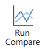
By using Run Compare you can switch between viewing the whole file to individual runs from the results table.
The standard display highlights regions of the graph to indicate where the selected runs occur.
Click on the Run Compare button to show individual runs from the results table.
When a run (or runs) are selected from the Test Results area, those runs will be displayed on the graph with a common origin. If a run starts or ends between data samples, the start and end values will be interpolated between samples to provide the desired result.
For example, if you are running a Decel Test (60 – 20 mph), any selected runs displayed in the graph will start at 60 mph and end at 20 mph, even if the data samples closest to the test criteria are 60.5 mph and 19.6 mph.
NOTE
Run Compare will be on by default when using Online mode.

By ticking Avg in Test Results table and clicking on the Average Only button on the Chart tab, the software will only display the average ‘best fit’ curve of all selected runs.
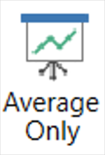
By ticking Avg in Test Results table and clicking on the Average Only button on the Chart tab, the software will only display the average ‘best fit’ curve of all selected runs.

Click on the Legend button to display a legend that indicates which file or run each coloured trace belongs to.
The legend will display the names of any selected files or runs.
If you have more than one file or run, you can use the tick boxes next to the file names to show and hide the traces from the graph.
Click on the colour square on the legend to change the colour of the related channel traces.

Click on the Add Chart button to add a new chart that has an independent X-axis from the existing chart(s).

Click on the Add Chart button to add a new chart that has an independent X-axis from the existing chart(s).

Click on the Line Style button to open a dropdown menu where you can choose the style of the chart lines.
You can choose between Normal and Sharp for the lines and whether you want to see the individual GNSS logging points or not on the lines.
Sharp is the default style, which details every deviation.
Normal provides a slightly smoother trace.

When you click on the Zoom X button, the software will perform a horizontal zoom of the selected area in the chart when you left-click and drag the cursor to the right. Left-click and drag to the left to return to the full view.

When you click on the Zoom X button, the software will perform a horizontal zoom of the selected area in the chart when you left-click and drag the cursor to the right. Left-click and drag to the left to return to the full view.

When you click on the Zoom X-Y button, the software will perform a ‘box zoom’ of the selected area in the chart when you left-click and drag to the right to set the box. Left-click and drag the cursor to the left to return to the full view.

When you click on the Zoom X-Y button, the software will perform a ‘box zoom’ of the selected area in the chart when you left-click and drag to the right to set the box. Left-click and drag the cursor to the left to return to the full view.

When you click on the Pan button, you can pan the graph by left-clicking and dragging the cursor on the graph. You can only pan if the graph is zoomed in at.

When you click on the Pan button, you can pan the graph by left-clicking and dragging the cursor on the graph. You can only pan if the graph is zoomed in at.

Click on the Add Marker button to add a marker to the chart at the current position of the cursor.
Click on the button again to add a secondary marker.
The region between the two markers will be highlighted, enabling further actions, such as cutting and measuring.
Only two markers can be added to the chart, however, once they have been placed, you can move them on the chart by clicking and dragging them to a new location.

Click on the Remove Marker button to delete the last marker that was added to the chart.

Click on the Remove Marker button to delete the last marker that was added to the chart.

Click on the Mark Region button to change the left-click action on the chart.
When the Mark Region button is selected, you can click and drag on the graph to highlight a specific region that you can measure or cut.
Click on the Mark Region button again to change the left-click action of the chart back to Zoom X.

Click on the Cut button to remove a portion of the current file.
You have 3 different options:
- Cut Before Cursor – Remove all data from the start of the file up until the cursor location.
- Cut After Cursor – Remove all data from the cursor location up until the end of the file.
- Cut Between Markers – Remove all data from between the two marker locations.
When the cursor or the marked region overlaps with more than 1 session, the cutting will affect all overlapping sessions. Other sessions that are not overlapping and sessions that have been unselected from the graph will not be part of the cut.
After cutting, you will see an information box with details of all modified sessions. You can save all the affected sessions as separate VBOX files (.vbo/.vbb).

If you highlight a region in the chart, you can click on the Measure button to see a pop-up with details about the maximum, minimum and average values of all channels in that region. If a region starts or ends between data samples, the start, end, difference, maximum and minimum values will interpolate between samples to provide the desired result. The average value is computed from sample values only.
Double-click on a Min or Max value to move the chart cursor to that location.
You can export the displayed results to a .CSV file or to the clipboard to paste into another document.
The Gate area will mirror the gate options available in each test. You can find more information on the individual Test Page.
If you have not chosen a test, the Gate area will default to the following:

Click on the Add Gate button to add a virtual gate to the chart and map at the point of the cursor.
Gates are added as green lines. The line for the currently selected gate will become blue.
When you have added a gate, you can specify the gate width. The default gate width is 20 m.
You can now use the gates to define start and/or end conditions.
NOTES
- If you change the gate width, the last used gate width will be used as the default width for the next gate.
- Opening a plugin (either as a new tab or overwriting an existing one) will clear all set gates, requiring you to redefine the gates before you amend the test configuration to set start/end conditions.
Click on the Rename button to edit the currently selected gate line.
NOTE
Gates must have unique names.
Click on the Delete button to delete the currently selected gate line.
Click on the Delete All button to delete all set gate lines.
Click on the Export button to export the created gate(s) as an .spl file that you can reuse at a later date and that you can use with another VBOX product.
Click on the Import button to import a previously saved or provided .spl file. When the file is imported, the gates will be added in the order that they were saved in the .spl file.
Use the playback buttons to play or stop the real-time recording of any data, along with any associated video.
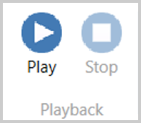
NOTE
Playback is not available when Run Compare is enabled.

Click on the Help button to automatically open an internet browsing window and load the relevant section of the VBOX Test Suite User Guide on the Racelogic Support Centre. This page will only be displayed if you have a valid internet connection. If there is no valid internet connection, you will see a cached version of the relevant section (from the last software update) presented in PDF form.

Click on the Help button to automatically open an internet browsing window and load the relevant section of the VBOX Test Suite User Guide on the Racelogic Support Centre. This page will only be displayed if you have a valid internet connection. If there is no valid internet connection, you will see a cached version of the relevant section (from the last software update) presented in PDF form.